Showing posts with label painting. Show all posts

Monday, December 30, 2013

99¢ Mantel

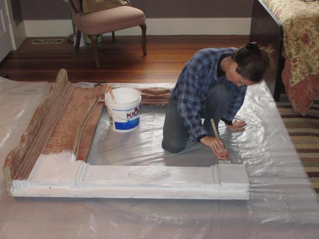
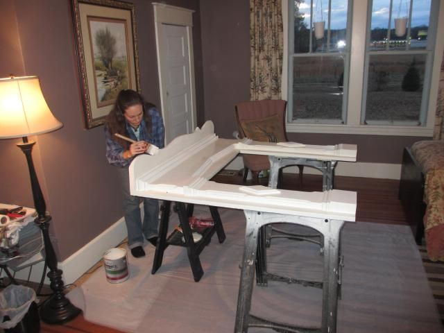
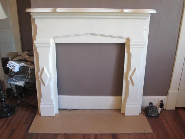
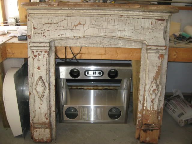
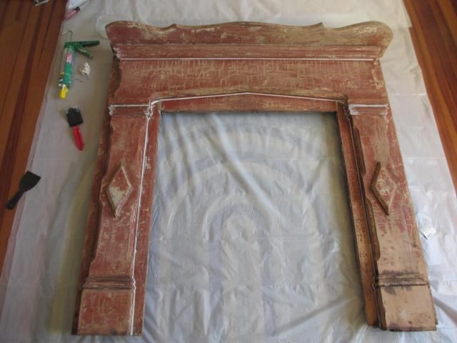
No pretty bathroom progress pics yet, but the adjoining guest room is looking a little nicer, due to a tiny step forward in reclaiming the fireplace in there. The credit goes to the shabby mantel that's not so shabby anymore. It wasn't a bad purchase for $.99, especially since I bought it over two years ago and didn't even know if I would get to use it. But after all the restoration work it has required the past few weeks, I'm glad I didn't pay much more!

 I don't know if it was purposely "shabby chic" or just really neglected, but I'm leaning more toward the latter. After scraping, heat gunning (if that's not a word, it should be), cutting, repairing, sanding, caulking, priming, and painting, the mantel is fit for the guest bedroom!

Before:
 photo misc014.jpg

Stripped bare:
 photo 2013-12-12012.jpg

Priming:
 photo 2013-12-24001.jpg

Painting:
 photo 2013-12-24012.jpg

Sadly, the guest bedroom firebox is not quite ready for such a lovely surround. It will probably be months before we tear open this brick wall, especially after our lengthy experience with the other firebox (which you can read about here and here)! But the mantel is now sleek instead of shabby and, more importantly, out of our shop and closer to realizing its potential. Even if we never get a real fireplace installed, I will have gotten to enjoy the effect of a design idea concocted before we even purchased the house!

Propped:
 photo 2013-12-24050.jpg

Sunday, December 22, 2013

Craft Room Follow-Up

My gawky craft roof is finally coming along. It's been slow going, since the bathroom really needs to take priority, but I have been able to get a few things done here and there. I still need to do something with the window sashes and muntins; I'm thinking of trying a dark ebony stain first. If I don't like that, then I can just paint it all white like the trim. The floor still needs to be sanded and finished, and I'd like to install baseboards while I'm at it. I'm also planning a box cushion for the windowseat. But the new wall and ceiling color (BM Revere Pewter) and painted trim (BM Linen White) have really brightened up the room. It definitely reflects a lot more light; even into the upstairs hallway, which I wasn't expecting!

Before we moved in:
 photo MGmanual025.jpg

Interim:
 photo 47Upstairsgableroom.jpg

Now:
 photo efd3fbd6-974d-4248-b894-d37f53f72cd5.jpg

 photo 2013-12-24035.jpg

The wall color looks a little washed out in these photos, but it's a warm gray or light taupe. You can see the difference compared to the creamy white door and window trim.

The room is pretty sparse right now, but for a sewing and craft center, I think I like starting that way. It will fill up fast! I have a folding table I can set up for cutting or pattern layout, and I may build a fold out top for the bureau to serve as an extended work surface, too.

I mentioned the retro shortie curtains in a post a few days ago about window treatments. I was thrilled that they worked so well with my rug! This dhurrie rug started out in the kitchen, then moved to our temporary bedroom, and now finds a long-term home in the craft room. I love when a piece is that flexible! It assures me that my design choices are cohesive enough for the house as a whole, instead of just individual rooms.

 photo b099badb-b336-4957-acc1-add9337f32bd.jpg

I really wish I could use a vintage pendant or some other unique lighting fixture in the room, but the upstairs ceilings are barely seven feet high. So I had to go with a flush mount that would light the corners of the room and not just glare down from the center. I'm satisfied with this halogen unit, and it was cheap enough to be a placeholder unless/until I can find something I really love. I installed it in probably less than half an hour (no nightmare lighting adventure like the guest room chandelier experience!), but at least fifteen minutes of that was trying to insert the small, fiddly halogen lights into the narrow shades using the special "relamping" tool, since you can't touch any part of the bulbs!

 photo 0202e17f-8ac1-4125-a446-2a5f8755cb66.jpg

Another little update was my sewing machine table. It's just a small desk I bought years ago. But I didn't know what I was doing at the time and painted it rather poorly with a cheap brush and low quality paint. This time, I sanded it down to smooth the bristle marks and gave it two coats of good paint with my favorite Purdy sash brush. What a difference!

Before repainting:

After:
 photo 2013-12-24045.jpg

 photo 4173759e-f83f-437e-a34c-e60b12e23c63.jpg

I was thrilled to find this vintage metal and wood ironing board at one of my local thrift stores last month. It was only $5, and I find it functional as well as lovely. Double score on the William Morris test!

"Have nothing in your houses that you do not know to be useful, or believe to be beautiful." - William Morris (father of the Arts and Crafts movement)

 photo c678c326-b773-4dd6-ac08-4369932191a6.jpg

It's a happy, streamlined little space now, so maybe after the bathroom remodel is done, I'll be able to get into the craft room and do some sewing!
Thursday, October 31, 2013

Ugly Duckling

Did you all have that awkward adolescent stage? You know, the one that involved white blobs of pimple cream on your blemishes? Well, I think my craft room is going through that acne scene right now.

 photo 2013-10-27003.jpg

I'm finally getting around to painting all that orange pine, but it's taking a lot of prep first. All the knots have to be primed with an oil based sealer, or they will bleed right through the finish coat. After hitting the worst spots, my poor room looks like a gangly teenager. It's definitely looking worse before it looks better. But I have confidence my ugly duckling will be a little swan one day soon.

Monday, July 29, 2013

Singin' the Blues

Just a little sneak peak, but we're loving the new wall color in the study. We are still in the middle of reworking everything in there (fireplace mantel, partners desk, drapes, etc.), but we had company coming so I quickly painted the ceiling, trim, and walls last week just to look presentable. Finally, no more half-done, sloppy bright aqua paint in our front room. It's a sophisticated yet very livable warm blue that sets off the trim nicely and should go great with the quartersawn oak mantel eventually.

 photo 2013-7-28012.jpg

 photo 2013-7-28004.jpg
The color is hard to capture, but these photos are close. It's Benjamin Moore Philipsburg Blue on the walls and Linen White on the ceiling and trim.

Monday, January 7, 2013

Sheen Down On Me

Life moves on, and I've been busy painting. What a difference the right paint sheen can make! There are some basic factors to consider in selecting paint sheen, like durability, touch-up potential, desired gloss, etc. But I can't think of a good reason why the previous resident painted the wood board-and-batten laundry room ceiling in high gloss. It only serves to highlight the very imperfect and rough texture of the cheap plywood panels. And I'm sure he wasn't up there scrubbing them regularly, because they were filthy.

I had already painted the crown molding months ago, so it was finally time to give the ceiling a nice, clean coat. I really like Benjamin Moore's ultra flat ceiling paint; it's so thick it rarely drips and it's tintable to any of their thousands of wonderful colors. I had to do a lot of cutting in, due to the little batten strips. But now it looks like a velvety soft cloud overhead, instead of a prickly, stubbly, garish glare.

Before:
Photobucket


After:
Photobucket

Thursday, December 6, 2012

Hiding in Plain Sight

I finally got around to a niggling little project several months late. Our central heat and air system was installed in the spring, and our air return is in the dining room wall. It's usually a bit obscured from the general line of sight by the piano, but since the floor finish is still curing, we haven't moved the beast back in yet. So I started noticing the large white grate and felt it was time to do something about the eyesore. I would love to upgrade to one of those decorative iron grilles like this:

Photobucket
But I'm not sure drawing attention to mine is the way to go, and they are also very expensive. So I whipped out my leftover wall paint and a small brush and gave the original grate a few coats (after a thorough cleaning, that is). Now it practically disappears (until the furnace kicks on and there is a whooshing sound in that general vicinity; kind of gives away my secret)!

Before:
2012-10floors3-1


After:
2012-12-5001

Friday, July 6, 2012

Drum roll, please

Make that a tentative drum roll, that is. Maybe just a little bongo instead of a snare drum. I have to give that disclaimer because I'm not sure I like the results myself, but here it is.

The guest bedroom is painted. It's not done, because I'm still planning the bedding, window treatments, lighting, accessories, etc., but I used what I have on hand to make it liveable. Since my nieces are arriving any day now, I just wanted to get some fresh paint on the walls of their guest room. But I didn't have time to take the doors down to properly paint them and strip the hardware, so just squint hard to ignore the minty green. So here it is, my unusual color choice of...SMURPLE (that is, Sarah's Murky Purple).

 Before:
Photobucket

After:
2012-7-9007

Before:
Photobucket

After:
2012-7-9006

This is a very new shade for me. In fact, it's a new shade for anyone, because it's a bit of our own concoction. It was intended to be Sherwin Williams Chinchilla, but due to some irregularities with their formulas, they couldn't get it to match their own sample. Jeff and I had to play with it until we got what we wanted (though I'm not sure now it's what I wanted, or maybe it was and I just don't want it anymore)!

Photobucket

I actually think the color looks better in the pictures than it does in real life. It can take on a very blah brown hue at times. This room has large west-facing windows and gets a lot of strong afternoon sunlight, so I know it can handle a dark, rich color, but I'm not sure this is the shade. I really wanted to make the lovely molding more prominent, and the contrast between the dark background and the creamy trim does certainly accentuate that.

This room is still in store for lots of changes. We haven't even decided if this is the furniture we will use in here. We have an antique iron bed that I would prefer to see, but placement gets tricky because of all the doors and windows. I also have an antique mantle stored in the shop, and one of these days we'll see about opening up the old firebox in this room. The hearthplate and chimney are hidden in the bumpout behind the dresser, but I can just imagine the white mantle centered on that wall, under the pastoral painting. So stay tuned for future developments in the Smurple (or maybe not) bedroom!

Monday, July 2, 2012

Caulk Talk

I have been itching to paint the downstairs guest room, but it is a daunting job. Painting walls is rather simple; almost fun, when you realize how much of a dramatic change you can achieve with just a gallon or two of paint. Painting the ceiling is not so pleasant, but it goes pretty quickly since it's just one expanse (although you have to keep drips and spatters from furnishings and floors). Painting trim is probably my least favorite job; it's meticulous work, the high sheen paint shows every flaw, and this house has miles of molding (an attractive problem to have, but there it is nonetheless).

But this particular job doesn't just require painting three surfaces three different colors and sheens. It requires a thorough, deep cleaning of years of accumulated debris. And sanding and caulking off years of abuse. Then there are holes to fill, dents to flush out, gaps to hide, cracks to smooth, wood and wall boogers to scrape, etc., etc,. etc. And not just on the moldings, but in the plaster, on the paneled doors, at every juncture and join and seam.

I've been prepping for the past two days, and all I see is a maze of messy caulk. But I have finally arrived at the painting stage, so progress is in sight. I just hope my unusual wall color choice is a success, because I doubt I'll be up to redoing it anytime soon!

Photobucket
Several rooms in the house were painted this identical minty green color in flat paint. Walls, trim, doors, all surfaces in an unflattering, unwashable finish. Now that I have to cut in everything, I'm starting to see why they took the easy route!  

Tuesday, December 27, 2011

Post Painting

I wish I could say we got the Goldilocks coat of paint on the cabinets with our third try (you know; too much the first time, not enough the second, just right on the last). Well, that's not exactly the case. Either this Benjamin Moore paint is the best paint out there or the worst; I can't decide! When you get the right coverage, it dries beautifully smooth and hard and glossy. But just a bit much and it runs and sags. Too little and it can't self-level, so it looks like an orange peel.

The problem was compounded because we were spraying the paint. Most pros brush or roll the frames and spray the doors. Because I have so many cabinets and the interiors badly needed painting as well, I decided to spray. On a vertical surface with many angles, there are just too many opportunities for excess paint to build up and drip, as we discovered on the first pass. So we went much lighter on the second coat, almost misting it. But that produced overspray everywhere that dried very rough. My satiny smooth finish was no more! So we changed spray tips and tried again, with only limited success. We ended up having to hand-sand a number of runs and sags, which I will touch up with a brush.

I think spraying the doors and drawers will go much better, as those will be horizontal. There is quite a learning curve to this new top-of-the-line paint, but I think it's worth acquiring!

Photobucket
BM Vellum color in the new ADVANCE product line

Monday, December 26, 2011

Progress Report

The kitchen is coming along. I have cut in the crown molding and painted the ceiling (BM Linen White, a perfect creamy white for an old house).

Photobucket

The walls are being prepped for their paint coat, as well. After patching and priming the cracks, Jeff remarked that I must be writing Japanese characters on the wall. That top left one does rather look that way, doesn't it?

Photobucket

We carried in the counters and set them in place. After a few stomach sinking moments when it looked like the mitered corners were all wrong, Jeff figured out that we could chisel away some of the plaster along the walls and close up the gaps. Our wall angles are fairly square, but the plaster varies quite a bit in thickness. This discrepancy over several feet of counter run is enough to play havoc with a 45 degree seam. Out came the cold chisel and hammer and Jeff made it work. As I was admiring the profile of our counter nose, Jeff couldn't resist comparing his nosing to its.

Photobucket

Wednesday, December 21, 2011

Not quite, Mr. DeMille

Well, we have the first coat of paint on the cabinets! But they aren't ready for their close-up just yet. In fact, not for a while yet. A few places on the frames look more like a drippy ice cream cone than a satin smooth finish. This new paint from Benjamin Moore has some great properties, but run- and sag-resistant is not one of them. It's much trickier to spray than a standard latex. It does self-level and harden amazingly well. After applying it late last night and agonizing over all the drips, I expected it to look like a bunch of stalactites in there this morning. But it's actually not half-bad. But there is a lot of sanding to do before the next coat, so I'm off!

Photobucket Pictures, Images and Photos

Friday, August 12, 2011

Slave Labor

I absolutely promise you I didn't make the girls do this! Jeff and I do feel it is important for children to have jobs and duties around the house, simply by reason of the fact that they live there and are members of the family. So we had my nieces do some light cleaning, daily dish duties, etc.

But I certainly didn't force them to paint outside for hours in the sun and humidity; they volunteered for it! Both girls are very artistic, and I guess the novelty of getting to choose and apply the paints of their choice was a real thrill (at least for the first hour).

Photobucket

I had mentioned that one (of our many three) porch swings needed a coat of paint because it was weathered and a bit rusty. The girls immediately asked if they could do it. So I got out my paint deck and we selected coordinating colors for the frame and swing. After spray coats of primer and paint to the chains, they were ready to let loose on the rest of the swing. You can't tell from a distance, but the wooden bench is a soft cream (SW Antique White) and the frame is a subtle sage green (BM Nantucket Gray); we think it will really look beautiful in the spring when the nearby tulip magnolia tree is in full bloom with showy lavender blossoms! Jeff positioned the swing to look out over the pasture so we can enjoy the view in the meantime.

Photobucket
The birds enjoy it, too. You can just make out a dove sitting
near the top of the swing frame taking in the morning!